
Mastering Renko Charts for Flawless Trading
Many charts have been introduced in the financial markets to make analysis accurate, flawless, and effortless. Candlestick charts show the open, close, high, and low while Renko charts are more similar to line charts because Renko charts focus on the trend.

In this article, we will focus on Renko bars and charts and explain how to use them in the market.
What are Renko charts and Renko bars?
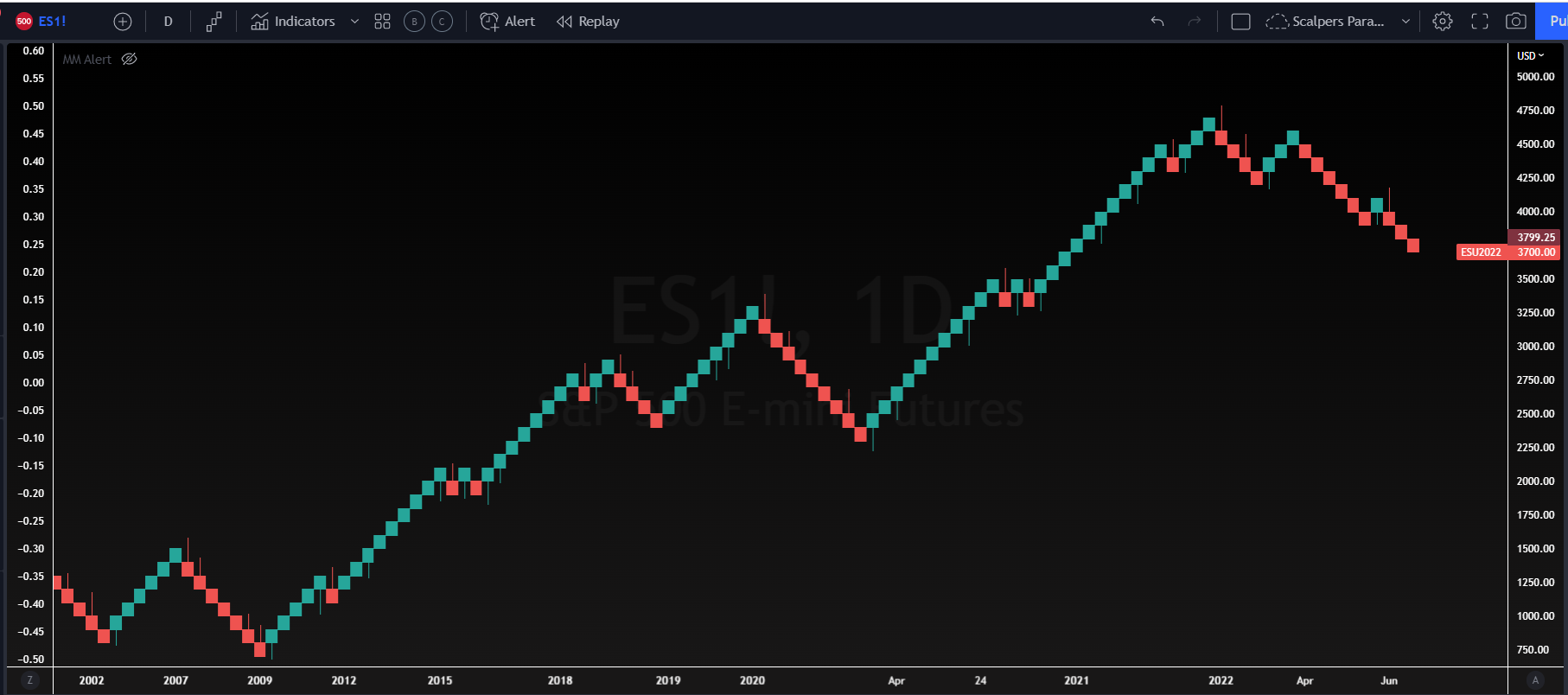
A Renko chart was developed by the Japanese that was built using price action highlighting trends instead of standardized time intervals. Renko charts separate, eradicate or dull out minor price movements to draw traders' attention to the more significant trends.
Renko bricks are sometimes called blocks and bars. So Renko bars are the elements of the chart used to display the data. These bars are the same length but placed at different places to show the progress. However, these bars are created or set at 45 degrees of angle and can be of any closing price sizes, such as $0.10, $0.50, $5, $10, and so on.
The bars are price specified. When the price increases, the bars are either white or green. When the price declines, it turns, making it easy to track the direction in which it is made. When utilized correctly, Renko charts can assist in resolving confusion about future price movements.
Using Renko charts on Tradingview?
The ability to switch to different trading charts can be extremely helpful for traders looking for a different perspective. Renko charts are easily accessible on Tradingview by clicking the chart type in the top right. A better understanding of where to find this button can be visually seen in the picture below.

Renko charts are created by Renko bars that move up and down at 45 degrees angle from the previous one. The bars never come side by side with one another. The user has the authority to determine the new brick size of the bar, which then determines when the new bars dorm.
Let's analyze the settings for the Renko chart with the picture below. If the new Renko brick size is 3, it implies that when the price action increases or decreases up to 3 points from the closing point of the previous brick value to form a new bar.
In order to adjust these Renko chart settings in Tradingview, traders must right-click the screen, click Settings, and change the assignment method to that of choice.

How do Renko Bars change color?
As the Renko bar will stay the same color and in the same trend unless the price moves up or down double to box size. Once a move this large occurs the Renko brick will create a new Renko brick in the opposite direction with a different color. Any movement smaller than the specified brick size will not show an impact on the visual.
Renko bars can be used on any timeframes which makes this chart type very versatile for all types of traders. A new Renko bar will result in brick that closes at the end of the time period. In the example below the Renko bars recently changed from red to green. For this color change to occur the price reversal needed would need to be more than the brick size (which for this chart is 35).

As a user, you can select a time frame ranging from 1 second to one month. Selecting the 2-minute chart implies that the bars are drawn based on the closing price every time. However, the Renko charts filter can effectively and clearly show the financial movement for every industry, including ETFs, stocks, indices, etc.
Renko vs Heikin Ashi charts
Heikin Ashi charts are also developed by the Japanese and it is a Japanese word. It is another valuable chart in the field of trading. However, it is different from Renko charts in that they gather and display the average of recent price movement. On the other hand, Renko charts focus on the mega trends regardless of time.

The Heikin Ashi chart shows sustained periods of up or down boxes to highlight the trend. On the other hand, the Renko chart patterns follow a fixed box size. Heikin Ashi takes the leverage of high, low, open, and closes for past and current times. Hence, the box size is different and reflects the average price. Despite differences, both charts help highlight trends in the same way.
Renko charts vs candlestick charts
This chart is quite different from the Renko chart. It mainly focuses on the timeframe and small price details. New candlestick forms after every fixed time interval regardless of how much the price moves.
For instance, assume there is only one transaction a day. The new candle will form on that day on a daily candlestick chart. This candle shows its low, high, close, and open price.

On the contrary, the Renko chart does not show the open, compact, high, and low cost of each trading day and does not generate new bricks after a particular interval. In the Renko chart, the new brick only forms when the value movement reaches the minimum threshold opposite of the regular candlestick chart.
Renko strategies
Renko charts can be used for value monitoring for different financial instruments. Traders can incorporate it into their trading strategies. Here are some common trading strategies to do it:
Renko Trend Changes
The most popular strategy for playing Renko charts involves trading the major trends shown. A new trend can be presented when the candle changes colors but traders need to be patient to wait for this trend. A good strategy using patience involves waiting for the Renko chart to show 2-3 candles of the same color before entering into a trade.

Clean chart pattern
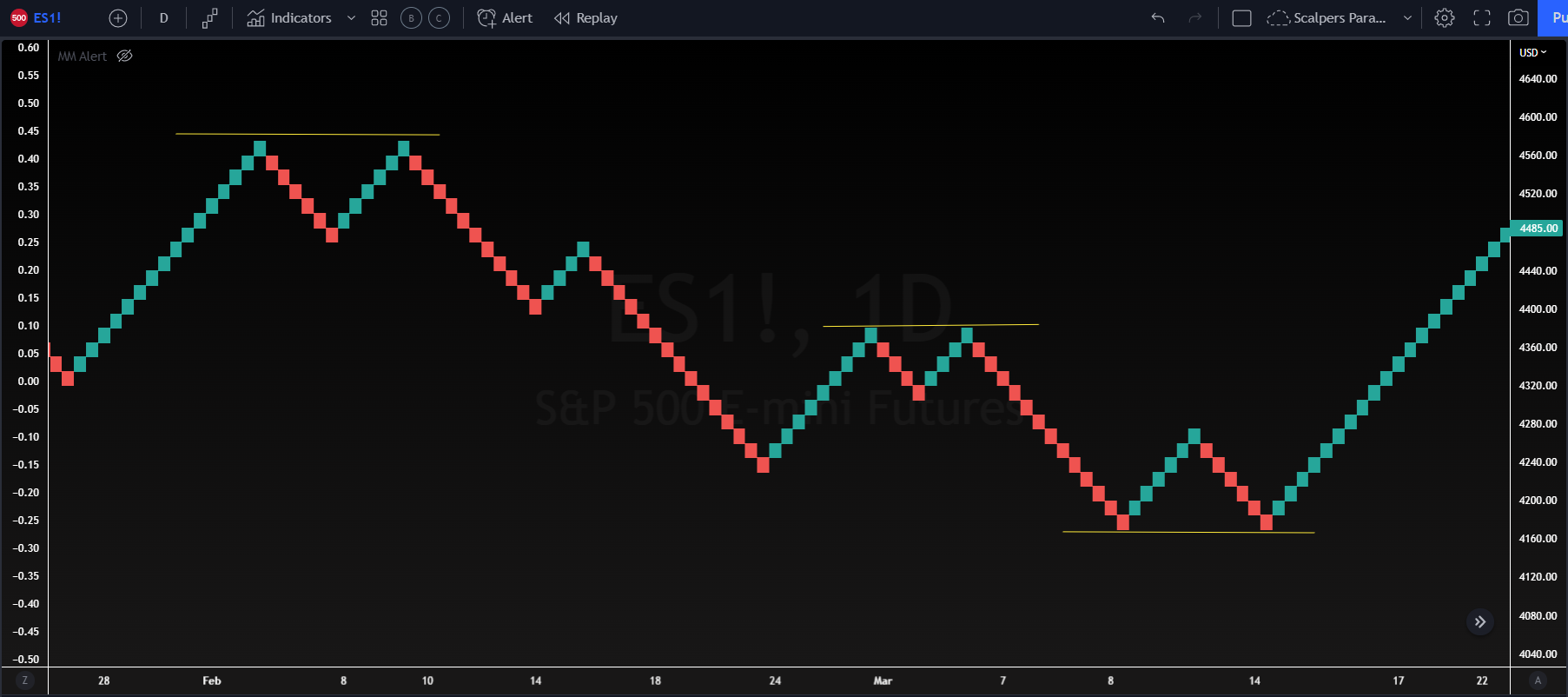
Similar to the pattern forms on candlestick charts, for example, head and shoulder, rounded tops and bottoms and triangles, etc., the patterns form in Renko charts. These patterns are easy to spot on Renko charts as minimal price movement exists.
As we can see in the Tradingview chart below the Renko chart easily shows double tops and double bottoms when appearing on a chart. The lack of wicks, bodies, and noise gives traders a much cleaner way to view trends, resistances, and support levels.
Use of Renko chart as trailing stop-loss
For traders willing to capitalize on trends, the Renko bars or chart is a valuable instrument to stick to the trend until a sizable reversal appears. When trends run for a long time, it will result in high profits. Anyhow, it is difficult to figure out which cost moves will run and which will end in loss and reversal.
The same way traders enter into a Renko chart is the same way traders can exit trades. The change in color can help traders know the exact moment a trend reverses.
Advantages of Renko Charts
Indeed, the candlestick charts and Heikin Ashi are excellent day trading charts, but certain aspects rank Renko charts above them. There are six benefits of selecting Renko charts over others. It includes:
Trend identification: It is pretty convenient to track a trend in a candlestick chart pattern, but the Renko chart takes the convenience to another level to identify downwards and upwards trends.
Market noise filtration: It eradicates all distractions. The Renko chart mainly focuses on the opening price and price closes of a particular asset while removing the time factor.
Determine the time of leave position: It is the most significant benefit as candlestick lacks it. Renko bars or charts offers the opportunity to determine the time of offset position.
Advantageous for mutual funds: These charts is essential in some particular types of markets as they work admirably in mutual funds markets that offer only closing patterns.
The broader perspective of the market: Renko chart provides a more overall trend vision of the market as the trader do technical analysis of patterns and provides a long-term view of the market.
Limitations of using Renko Charts
Renko chart offers many admirable benefits but with certain limitations. These type of charts does not display as many details as other charts.
Moreover, the stock that has been available for a long time is represented as a single box that does not convey everything happening during the time. It may be advantageous for some traders but not for others.
High and low prices have been ignored. It misses out on essential price data as high and low prices fluctuate long before closing. The consideration of only price information deduces the noise amount. Still, the cost may break significantly before the formation of new boxes, making it difficult to go to the market before a manageable loss.
Conclusion
When it comes to financing management, the possibility of loss increases. However, the trader can decide to control the risk and manage how much capital they can endure. Here comes the role of the Renko bars and charts.
This chart helps monitor price movements and predetermines to exit the trade when the asset is more likely to move. It also strives to reduce the chance of more significant losses if the single trade does not come out well due to technical analysis.